How to Achieve the Perfect Balance between Aesthetics and Functionality in Web Design
In today’s digital world, having a visually appealing website is no longer enough to attract and retain visitors. Users expect beautiful and functional websites allowing them to navigate and find the necessary information easily. Achieving this perfect balance between aesthetics and functionality can be challenging for web designers, but it’s essential for creating a successful online presence. In this blog post, we’ll explore tips and tricks to help you achieve the ideal blend of form and function in your web design projects.
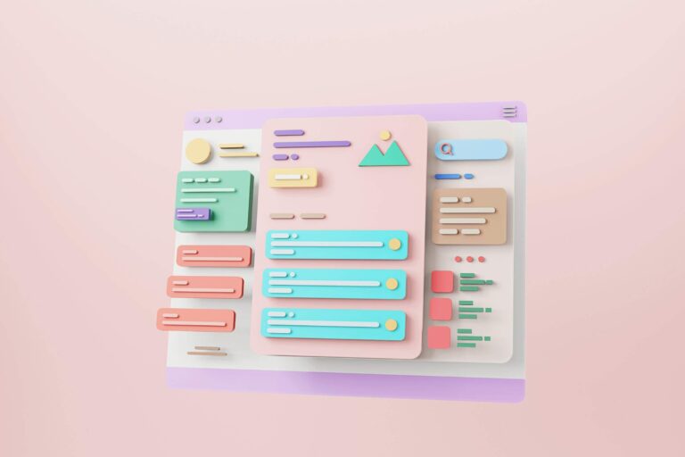
Introducing Web Design Fundamentals
Web design is the process of creating a website that is both aesthetically pleasing and functional. The goal is to create a visually appealing site that is easy to use and navigate. There are many factors to consider when designing a website, such as a layout, colour scheme, font choice, and content. It can be overwhelming to balance these elements, but it is important to create a successful website.
The first step in web design is to determine the site’s purpose. What are you trying to accomplish with your website? Once you know the site’s purpose, you can begin to plan the layout and design. The layout should be simple and easy to understand, with clear navigation. The colour scheme should be cohesive and complement the site’s overall design. And finally, the content should be well-written and relevant to the website’s topic.
If you take the time to consider each of these elements carefully, you can create an aesthetically pleasing and functional website. By following these tips, you can perfectly balance aesthetics and functionality in web design.
Common Elements of a successful website design
Many elements go into making a successful website design, but there are some common features that all successful websites share. Here are some of the most important elements of a successful website design:
Layout: The layout of a website is important for both aesthetic and functional purposes. A well-designed layout will ensure that your content is easy to read and navigate and looks good.
Design: The design of your website should be both eye-catching and user-friendly. Avoid cluttered designs with too much text or images, as this can overwhelm visitors. Instead, focus on creating a clean and stylish design that makes it easy for users to find what they want.
Content: Content is king when it comes to website design. Ensure your content is high-quality and engaging, as this will keep visitors coming back.
Search Engine Optimisation (SEO): SEO refers to optimising your website for search engines to appear higher in search engine results pages (SERPs). This means ensuring your website has relevant keywords, well-written content, and a mobile-friendly design.
Navigation: Navigation is an important part of any website design. Ensure your navigation is intuitive and easy to use, so visitors can easily find what they’re looking for.
Speed: The speed at which a website load is important for user experience. If your website takes too long to load, visitors may become frustrated and leave before seeing what you offer.
Security: Security is essential for any website, as it helps ensure user data’s safety. Ensure your website has security protocols to protect users’ information.
Choosing the Right Colour Scheme for Your Website
There are a few things to consider when choosing the right colour scheme for your website. The first is the overall look and feel you want to achieve. For example, are you going for a minimalist design or something more ornate? The colours you choose should complement the overall tone of your site.
The second thing to consider is functionality. Certain colours are easier to read on screen than others. For example, dark text on a light background is generally more legible than light text on a dark background. If you want people to stay on your site and read your content, choose colours that will be easy on the eyes.
The third thing to think about is your brand identity. If you already have an established brand, you’ll want to use colours that are consistent with what people already associate with your business. This will help create a cohesive look and feel across your marketing materials, from your website to your social media accounts.
Choosing the right colour scheme for your website doesn’t have to be difficult. By considering the overall aesthetic you’re going for, the functionality of the site, and your brand identity, you can narrow down your choices and find a palette that works for you.
What Fonts Will Best Represent Your Brand?
The first step is understanding what fonts are available and how they best represent your brand. There are two types of fonts: serif and sans serif. Serif fonts have small lines at the end of each letter, while sans-serif fonts do not. Each type of font serves a different purpose and can create a different feeling for your brand.
Serif fonts are typically seen as more traditional, serious, and formal and are often used for business or academic purposes. Some examples of serif fonts are Times New Roman, Georgia, and Cambria.
On the other hand, Sans serif fonts are seen as more modern, simple, and clean and work well for brands that want to appear approachable and friendly. Some examples of sans serif fonts are Arial, Helvetica, and Verdana.
Once you understand the different types of fonts available, you can start narrowing down which ones will work best for your brand. Consider the overall feeling you want to convey with your website design. For example, a serif font may be a good choice if you want something classic and timeless. Sans-serif fonts may be better if you prefer a more modern look.
In addition to your website’s overall feeling, consider the specific message you want to communicate with your font choice. For example, if you’re designing a website for a law firm, a serif font may be more appropriate since it conveys a sense of professionalism and trustworthiness.
Finally, make sure you’re considering how legible your font choice is. The font should be easy to read and not distract from the main message of your website.
Ultimately, choosing fonts for your brand depends on what kind of feeling you want to create and what message you want to communicate with your design. Take some time to research different fonts and experiment until you find the perfect one that fits your needs.
Incorporating Visual Hierarchy in Design
In web design, achieving the perfect balance between aesthetics and functionality can be challenging. However, incorporating visual hierarchy into your design can help create a more balanced and effective overall design.
Visual hierarchy uses various design elements (e.g. colour, size, shape, etc.) to create a hierarchy of importance. When used correctly, visual hierarchy can help guide users through a design that is aesthetically pleasing and functional.
There are a few key things to keep in mind when incorporating visual hierarchy into your web design:
- Use contrast to create visual interest and draw attention to important elements.
- Use a scale to emphasise certain elements over others.
- Use alignment to organise information in a way that is easy to understand and visually appealing.
- Use grouping to separate different types of information and make complex designs more manageable.
By following these guidelines, you can create a web design that is both beautiful and functional. Remember to experiment with different techniques until you find the best combination for your project.
How to Make Sure Your Website Is Responsive and Mobile-Friendly?
Your website is the face of your business, so it’s important to ensure it’s responsive and mobile-friendly. Nowadays, more and more people are using their mobile devices to access the internet, so your website must be optimised for these users. Here are a few tips on how to make sure your website is responsive and mobile-friendly:
- Use responsive design. This means your website will automatically adjust to fit any screen size, whether a desktop, laptop, tablet, or smartphone.
- Use large font sizes. Ensure your font sizes are large enough to be easily readable on a small screen.
- Use icons instead of text. Icons are easier to see and understand on a small screen than text, so use them whenever possible.
- Simplify your design. Keep your design clean and simple so that it’s easy to navigate on a small screen.
- Test your website on different devices. Test your website on all devices to ensure it looks and works well on all of them.
Optimising Your Website Content for SEO
Your website’s content is one of the most important elements in SEO. There are a few things you can do to make sure your content is optimised for search engines:
1. Use keyword-rich titles and descriptions. This will help your content show up in search results for those keywords.
2. Structure your content using headings and subheadings, making it easier for search engines to understand and index your content.
3. Include relevant keywords throughout your content. This helps search engines understand your content and match it with relevant searches.
4. Keeping your content fresh by regularly adding new and updated information helps keep your site indexed by search engines and keeps visitors coming back for more.
5. Make sure your website is accessible to both search engines and users by using proper coding and structure. This will ensure that both groups can find and use your content easily.
Utilising Advanced Technologies in Web Design
As a web designer, it is important to find the perfect balance between aesthetics and functionality when creating a website. One way to achieve this balance is by utilising advanced technologies in your web design.
Various advanced technologies can improve a website’s aesthetic and functional aspects. For example, CSS3 and HTML5 are newer programming languages allowing more complex styling and animation effects. Additionally, a responsive design can ensure that your website looks great and functions properly on all devices.
When utilising advanced technologies in your web design, keeping the user experience in mind is important. Make sure that any features you add are easy to use and understand. Otherwise, you can avoid confusing or frustrating your visitors.
By finding the perfect balance between aesthetics and functionality, you can create a website that is both beautiful and easy to use. Utilising advanced technologies can help you achieve this balance and build a better website overall.
Conclusion
Achieving the perfect balance between aesthetics and functionality in web design is challenging yet achievable. By following our tips and keeping your user’s needs in mind, you can create an aesthetically pleasing and functional website that will engage your users, keep them coming back for more and help to achieve your business goals. With careful planning, thoughtful design decisions and a little creativity, you, too, can have the perfect balance between aesthetic appeal and practicality for your business’s website!