In today’s rapidly evolving digital world, it’s not just a nice-to-have, but a must-have to establish yourself online. Regardless of whether you’re managing an online store, a blog about your personal experiences, or a website for your business, taking care of your digital space has never been more important. This is where our comprehensive website maintenance guide comes in. We’re here to delve into the nitty-gritty of this essential task and address a common query: Is it truly indispensable?
Understanding Website Maintenance
Basically, website maintenance means taking care of a website so it keeps working well. This involves doing regular things to make sure the site runs smoothly.
Website maintenance covers lots of tasks. The goal is to make sure your site stays safe, up to date, and functional for your target audience. This means doing things like fixing any broken links, looking out for any security problems, and updating different tools that help the website work.
Think of website maintenance as the foundation of having a successful online presence. Just like a house needs maintenance to stay in good condition, a website needs regular attention to keep it running smoothly.
7 Benefits of Website Maintenance
The advantages of keeping your website well-maintained go beyond just checking off tasks from a to-do list. It’s a smart decision that brings a many benefits. Let’s dive into why it’s worth considering the maintenance of your website:
1. Enhanced Security
Cyber threats are a real and constant danger in today’s online world. Regular maintenance helps identify and address security vulnerabilities, ensuring your website and its sensitive data remain safe from potential breaches.
2. Improved User Experience
Imagine visiting a website only to find broken links, slow-loading pages, and outdated content. It’s frustrating, right? Website maintenance ensures that your site functions seamlessly, offering visitors a smooth and enjoyable experience. This, in turn, leads to longer page visits, lower bounce rates, and a higher likelihood of conversions.
3. SEO Advantage
Search engines thrive on fresh and relevant content. Regular updates, improvements in site structure, and responsive design can positively impact your website’s search engine rankings. A well-maintained website signals to search engines that your site is valuable and authoritative, potentially boosting your visibility in search results.
4. Increased Website Speed
In today’s fast-paced world, speed matters. Slow-loading websites can drive users away in seconds. With website maintenance, you can optimise your site’s performance, implement caching techniques, and use content delivery networks (CDNs) to ensure that your website loads quickly and efficiently, regardless of the user’s location.
5. Data Backup and Recovery
Accidental data loss, server crashes, or malicious attacks can jeopardise your website’s content and functionality. Regular backups as part of website maintenance give you peace of mind, knowing that your data is secure and can be quickly restored if needed.
6. Strengthened Brand Image
A well-maintained website reflects professionalism and dedication. It’s often the first interaction users have with your brand, and a positive experience can leave a lasting impression. On the flip side, a poorly maintained website can deter potential customers and harm your brand’s credibility.
7. Cost Savings in the Long Run
Neglecting website maintenance might lead to major issues down the line. A security breach or a significant functionality breakdown could cost you not only financially but also damage your brand’s reputation. Regular maintenance helps you catch and address issues early, preventing them from escalating into costly problems.
What’s included in a Website Maintenance Plan?
At 10MILE Studio, we offer a comprehensive Website Care Plan that go beyond routine tasks to ensure your website remains secure, functional, and up-to-date. Here’s a closer look at what you can expect from our Website Maintenance Plan:
Premium WordPress Managed Hosting: Our WordPress Managed Hosting provides a fast, secure and optimised environment for your website.
SSL Certificate: we include an SSL Certificate to encrypt data transmitted between your website and its users, giving your visitors the confidence that their information is safe.
Content Delivery Network (CDN): Our CDN ensures that your website’s content is delivered swiftly to users around the world, reducing loading times and enhancing the user experience.
WordPress Core Updates, Theme Updates, Plugin Updates: Keeping your WordPress core, themes, and plugins up to date is essential for security and compatibility. Our regular updates ensure your website is running on the latest, safest, and most efficient versions.
Daily Server and Weekly Cloud Backups: Accidents happen, but with our daily server and weekly cloud backups, your data is secure. In case of any mishaps, we can quickly restore your website to its previous state.
Broken Link Monitoring: Broken links can harm your website’s user experience and SEO. We monitor and fix broken links, ensuring that your visitors can navigate your site without frustration.
Website Security Checks: We conduct routine security checks to identify and address vulnerabilities, keeping malicious entities at bay and safeguarding your website and its visitors.
Functionality Monitoring: A glitchy website can lead to lost opportunities. Our functionality monitoring ensures that all features and functionalities are working as intended, providing a seamless experience to your visitors.
Emergency support and Immediate Response to Critical Issues: Sometimes, emergencies just pop up out of nowhere. It’s in moments like these that having a solid emergency support team really makes a difference. Here at 10MILE Studio, we totally get how pressing these situations can be. That’s why we’ve got your back with our emergency support included in our Website Maintenance Plan.
Conclusion: Do I Really Need Website Maintenance?
So, you’ve been exploring the ins and outs of website maintenance, and now you’re wondering, “Is it really necessary?” The answer, in a nutshell, is a resounding yes. Here’s why.
Your website isn’t just some digital real estate; it’s your virtual HQ, your digital storefront, the place where all the magic happens. Skipping out on proper maintenance? Well, that’s like inviting trouble over for a long stay.
Regular website maintenance is an investment in the smooth operation, security, and success of your online presence. Think of your website as a car – if you don’t change the oil, rotate the tires, and fix any issues that pop up, it won’t be long before your car starts breaking down on the side of the road. Similarly, neglecting website maintenance can lead to a gradual deterioration of your site’s performance, user experience, and security.
If you’ve got any more questions or need a hand with your website, feel free to reach out or book a free website audit below. We’ve got a team of experts ready to take care of all your website needs, so you can kick back and relax.
CDN stands for Content Delivery Network, and it’s a clever solution designed to make websites faster, more reliable, and accessible to users all around the world. Imagine your favorite online store or news website – whenever you click on a link or type a URL, your browser connects to a server hosting that website’s content. The server then sends the required files – like images, text, videos, and scripts – to your browser, which assembles them into the webpage you see.
Here’s where CDNs step in to revolutionise this process.
The Core Concept of CDNs
Imagine you’re a book lover and your favorite author’s new release is about to hit the stores. You could travel all the way to the publisher’s main office to get your copy, or the publisher could distribute the books to various local bookstores, making it much quicker and easier for you to access the book. This distribution network concept is similar to how CDNs work.
In essence, a CDN is a network of servers scattered across different geographical locations. These servers store cached (saved) copies of your website’s content. When a user visits your website, instead of fetching all the content from your main server, the CDN helps by delivering the content from the server nearest to the user’s location. This significantly reduces the distance the data needs to travel, resulting in faster load times.
Most Popular CDNs
Some big players in the CDN game include Cloudflare, Akamai, and Amazon CloudFront. These services have user-friendly setups that guide you through the process. After signing up, you might need to adjust your website’s settings a bit and sync your content with the CDN. It’s not as hard as it sounds!
In Conclusion
In a nutshell, CDNs are website performance boosters. They speed up load times by storing content on servers near users. This global network of servers reduces delays, distributes traffic, and even adds a layer of security. Popular CDN services make it simple to set up, meaning your website can enjoy these benefits without requiring technical know-how. So, next time you experience a fast and seamless website visit, you might just have a CDN to thank!
How to Clear Your Browser Cache on Desktop and Phone
What is cache?
In the digital world, “cache” is a bit like a secret storage spot where your browser tucks away copies of stuff from websites you’ve visited. We’re talking about web pages, images, those little scripts that make sites work smoothly – all saved up to make your browsing quicker. So, when you revisit a site, instead of starting from scratch, your browser can just pull out those cached copies and load faster.
But here’s the twist – this cache stuff can sometimes trip you up. It might make you see outdated content on a site or even hold onto private things like cookies or login details.
How do I clear my cache?
Clearing your browser cache is a quick and effective method to maintain an optimal browsing experience. It comes in handy when you face problems such as slow loading speeds, outdated content, or privacy issues. Here, we provide a guide on how to clear your cache on commonly used desktop and mobile browsers:
Google Chrome
How to Clear Cache on Google Chrome (Desktop)
Open Chrome.
Click the three dots in the top-right corner to open the menu.
Hover over “More tools” and select “Clear browsing data.”
Choose a time range or select “All time” to clear all data.
Check “Cached images and files” and any other data you want to clear.
Click “Clear data.”
How to Clear Cache on Google Chrome (Mobile)
Open Chrome.
Tap the three dots menu in Google Chrome.
Go to “History” and then “Clear browsing data.”
Select a time range or choose “All time.”
Check “Cached images and files” and other desired items.
Tap “Clear data.”
Safari
How to Clear Cache on Safari (Desktop)
Open Safari.
In the top menu, click on “Safari” and select “Preferences.”
Go to the “Privacy” tab.
Click “Manage Website Data.”
A list of websites will appear. Click “Remove All” to delete all cached data, or select specific sites and click “Remove” to delete data for those sites.
Confirm your choice by clicking “Remove Now.”
How to Clear Cache on Google Chrome (Mobile)
Open the Settings app.
Scroll down and tap on “Safari.”
Scroll down again and tap “Clear History and Website Data.”
Confirm your choice by tapping “Clear History and Data.”
Internet Explorer
How to Clear Cache on Internet Explorer (Desktop)
Open Internet Explorer.
Click the gear icon (Tools) in the top-right corner.
Select “Safety” and then “Delete browsing history.”
Check “Temporary Internet files and website files.”
Click “Delete.”
Firefox
How to Clear Cache on Firefox (Desktop)
Open Firefox.
Click the three horizontal lines in the top-right corner.
Select “Library” and then “History.”
Click “Clear Recent History.”
Choose a time range or select “Everything.”
Check “Cache” and any other desired items.
Click “Clear Now.”
How to Clear Cache on Android (Mobile)
Open Firefox.
Tap the three vertical lines in the top-right corner.
Go to “Settings” and then “Clear private data.”
Check “Cache” and any other desired items.
Tap “Clear Data.”
Microsoft Edge
How to Clear Cache on Microsoft Edge (Desktop)
Open Microsoft Edge.
Click the three dots in the top-right corner.
Scroll down and click “Settings.”
Under “Privacy, search, and services,” click “Choose what to clear.”
Check “Cached data and files” and any other desired items.
Click “Clear.”
How to Clear Cache on Microsoft Edge (Mobile)
Open Microsoft Edge.
Tap the three dots in the bottom menu.
Go to “Settings” and then “Privacy.”
Tap “Choose what to clear” under the “Clear browsing data” section.
Check “Cached images and files” and other desired items.
Tap “Clear.”
Clearing your browser cache might seem like a small task, but it can significantly improve your browsing experience by freeing up space and ensuring you have access to the latest website content. With this guide, you’re equipped to keep your browsers running smoothly on both desktop and mobile devices. Happy browsing!
Top Website Builders of 2023 Compared
Have you ever thought about creating your own website? Maybe you’ve got a hot new business idea, want to showcase your portfolio or share your thoughts with the world through a blog. Well, it’s never been easier to set up your digital home, thanks to the world of website builders. But with so many options out there, how do you choose?
Don’t worry; we’ve got your back! Let’s dive into the deep end and explore the top website builders of 2023.
What is a Website Builder?
If you’re new to the game, you might be wondering, “What is a website builder?” 🤔
A website builder is a tool or platform that allows you to create a website without needing to write all the code from scratch. Think of it as a Lego set for websites; you’ve got all these pre-made blocks and can put them together in any way you like.
Some are standalone platforms, while others, known as page builders, are plugins that integrate with a Content Management System (CMS) like WordPress.
Standalone vs WordPress Builders
The eternal debate: standalone builders like Wix and Squarespace or WordPress with a page builder like Elementor or Divi.
Standalone builders are perfect for beginners – they’re often easy to use, all-inclusive, and come with hosting. The downside? Less flexibility compared to WordPress.
Standalone website builders generally offer limited flexibility in terms of design and functionality, and unless you’re savvy with coding, you may find yourself bound by the elements and sections they provide.
WordPress, on the other hand, is a world of limitless customisation – pair it with the right page builder and you’re off to the races. But it can be a bit overwhelming for beginners, and you’ll need to handle hosting yourself.
The Top Website Builders of 2023
So, without further ado, let’s dive into the top website builders of 2023: Wix, Squarespace, Webflow, Shopify, Divi, Elementor, Oxygen and Bricks.
Standalone Website Builders
Standalone website builders are platforms that enable users to create and manage websites without the need for separate web hosting or content management systems (CMS). These builders provide all the necessary tools and features within a single platform, allowing users to design, customise, and publish their websites without requiring additional technical knowledge or external software.
Standalone website builders often offer drag-and-drop interfaces, pre-designed templates, and a range of built-in functionalities, making it easier for individuals and businesses to create professional-looking websites quickly and efficiently. Some popular standalone website builders include Wix, Squarespace, Webflow and Shopify.
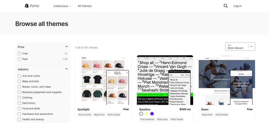
Wix
Wix is a standalone website builder known for its drag-and-drop interface and vast template options. It’s ideal for total beginners looking to build visually appealing sites without touching a line of code.
One of the strongest points of Wix is its wide range of templates, all sorted into categories like business, photography, blogging, and more, making it easier for users to find the perfect design for their site.
Aside from the design aspect, Wix also provides built-in tools for SEO, social media integration, and email marketing, making it easier to manage everything in one place. It also includes hosting in its packages, taking away the hassle of finding and setting up a separate hosting provider.
For those who are interested in selling products or services online, Wix doesn’t disappoint either. Its eCommerce capabilities are robust, allowing you to manage your inventory, track orders, and even send automated tax and shipping calculations.
Despite its seemingly limitless functionalities, Wix is still remarkably user-friendly. Its platform is designed with beginners in mind, providing on-screen prompts and tutorials to guide you throughout the building process. And if you do run into any issues, Wix’s support team is just a few clicks away.
Pros
Cons
✅ Easy-to-use drag-and-drop editor, perfect for beginners. ✅ Wide variety of templates available. ✅ Flexible design allows you to move elements around and place them wherever you want. ✅ Wix’s built-in SEO tools help improve your site’s ranking on search engines. ✅ Free version that enables you to build and publish a website at no cost (though it includes limitations such as Wix branding on your site and no custom domain).
❌ Unable to switch templates once your site is live. ❌ Slower loading times compared to other builders. ❌ Limited design customisation compared to WordPress page builders. ❌ Ads on the free version, which may not give a professional appearance. ❌ SEO limitations in terms of advanced SEO compared to WordPress websites.
Ideal for… Wix is a versatile website builder that caters to various niches and is perfect for individuals with no web skills or basic knowledge. Its intuitive drag-and-drop interface and wide range of template options make it ideal for small businesses, creative professionals, and anyone looking to create their own website quickly, easily, and without a big investment.
Squarespace is yet another standalone website builder, so everything from building to hosting happens in one place. It’s fantastic for newcomers who’d rather avoid the nitty-gritty of coding.
Squarespace is especially loved for its collection of over 60 gorgeous, award-winning templates. Each one is meticulously designed, focusing on clean lines, stunning visuals, and modern design principles. What’s more, these templates are all mobile-responsive, ensuring your site will look fantastic on any device.
Unlike some of its competitors, Squarespace doesn’t offer a free version. However, the value offered in its premium plans more than makes up for it. These plans include access to 24/7 customer support, unlimited bandwidth and storage, and even a free custom domain (for the first year) – elements that are often paid extras elsewhere.
For businesses, creatives, and retailers, Squarespace provides excellent eCommerce capabilities. Its eCommerce tools are comprehensive, from selling unlimited products or services to having control over discounts and promotions. Squarespace’s eCommerce plans have zero transaction fees, so you keep more of your profits.
Overall, Squarespace is a solid choice if your priority is professional and modern design, and if you’re looking for an easy-to-use platform for website building. However, it’s important to note that unless you have some coding skills, you will need to work within the limitations of their predefined sections and templates when designing your website.
Pros
Cons
✅ Beautiful designs and modern templates. ✅ Great for creatives such as photographers, artists, and designers. ✅ Solid blogging features for content-heavy sites. ✅ eCommerce capabilities for online stores. ✅ Mobile-responsive templates.
❌ Limited customization options without coding knowledge. ❌ No free version is available; paid plans are required, with a 14-day free trial offered. ❌ Restrictive design templates that may not be suitable for all website types or brands. ❌ Higher pricing compared to other builders.
Ideal for… Squarespace is an excellent option for creating minimalist websites, particularly for niches such as photographers, artists, designers, and creative professionals who place a high value on aesthetics. With its sleek templates and robust blogging features, Squarespace provides a great platform for showcasing portfolios and sharing visual content.
Webflow is a standalone platform that bridges the gap between no-code convenience and the flexibility of manual coding. It’s great for businesses looking for more control over their site.
It’s a standalone platform that seamlessly blends the ease of no-code design with the comprehensive flexibility that manual coding affords. Webflow has been particularly embraced by designers and developers who seek granular control over their site’s look and feel.
Webflow’s design flexibility is truly impressive. Unlike many drag-and-drop builders, it allows you to design your website exactly as you want, down to the very pixel. You’re not constrained to a grid or tied to predefined sections or templates. Yet, it presents this freedom in an interface that’s surprisingly user-friendly, with the CSS and HTML handled behind the scenes. You can create and manipulate complex layouts without having to write a single line of code.
Aside from its design prowess, Webflow boasts a built-in CMS that you can customise to suit your content perfectly. You can define your own content types, integrate with other platforms, and even add dynamic content to your site. This level of control makes Webflow a popular choice for blogs, portfolios, and business sites alike.
For those who are e-commerce-inclined, Webflow also offers robust e-commerce functionality. You can customise your entire shopping cart experience, set up secure payments, and even automate tax and shipping calculations. All these happen in the same Webflow interface, making for a seamless user experience.
Webflow’s cons lie in its learning curve. It is a bit more complex than traditional website builders, and it might take some time to get used to its interface. However, considering the level of control and flexibility it offers, many consider it’s worth the investment of time and effort.
In conclusion, Webflow occupies a sweet spot between simplicity and power. It’s perfect for designers seeking more control, businesses that need a powerful CMS, or anyone looking to push the boundaries of their web design without diving into manual code.
Without a doubt, Webflow sits at the top of our list of favourite standalone website builders.
Pros
Cons
✅ Full design customization for complete control over the look and feel of their site. ✅ Integration with various third-party apps. ✅ CMS functionality that makes content management easy. ✅ Advanced features for designing complex animations and interactions. ✅ eCommerce capabilities for creating online stores.
❌ Steeper learning curve compared to other website builders. ❌ Interface lacks the same level of intuitiveness as other builders.
Ideal for… Webflow bridges the gap between the convenience of no-code website builders and the flexibility of manual coding. It is a fantastic choice for any business that want to enjoy the convenience of using a website builder platform while retaining full design flexibility and avoiding limitations on features. With Webflow, you can create highly customised and interactive sites without needing extensive coding knowledge.
Shopify is a standalone eCommerce website builder specifically tailored for online stores and retail point-of-sale systems. It’s perfect for those looking to start or scale their online store without getting tangled up in complex coding or technical setup.
Shopify is the go-to choice for many online entrepreneurs for good reason. It offers an all-in-one commerce platform that lets you start, grow, and manage a business. You can customise your online store, sell in multiple places, including web, mobile, social media, and even brick-and-mortar locations, and easily manage products, inventory, and shipping.
But the appeal of Shopify extends far beyond aesthetic customisation and selling capabilities. It offers a comprehensive management tool suite that ensures your online store runs smoothly. You can easily manage your products, keep track of your inventory, and oversee shipping logistics. Shopify’s admin panel provides you a clear snapshot of your business’s performance, with reports and analytics to help you make informed decisions.
For those less confident in their web design skills, Shopify provides a range of pre-made themes – both free and paid. These themes are professionally designed and fully responsive, ensuring your store looks great on any device.
Designing a Shopify store is as simple as choosing (or purchasing) and installing a theme. While the prices of themes might look high, compared to the time and money required to build a custom e-commerce store, they are quite affordable.
In terms of support, Shopify has you covered. With 24/7 access to customer service via email, live chat, and phone, you can get answers to your queries or issues anytime.
While Shopify plans may be more expensive compared to some other website builders, its powerful capabilities and user-friendly interface make it a worthwhile investment for anyone serious about running a successful online store. In eCommerce, Shopify stands out as a comprehensive, reliable, and powerful platform.
Pros
Cons
✅ Tailored for eCommerce and designed specifically for online stores. ✅ Easy to use – even without coding or web knowledge, you can set up a store quickly. ✅ Extensive App Store to enhance your store’s functionality. ✅ POS system for selling in physical locations. ✅ Dropshipping integration with apps like Oberlo for seamless dropshipping.
❌ Pricing can be high. ❌ Transaction fees may apply (waived or reduced with Shopify’s own payment gateway). ❌ Limited blogging features. ❌ Customisation beyond themes requires coding.
Ideal for… Shopify is the ultimate website builder for online stores. It’s the go-to choice, especially if you’re looking to sell products online. With its eCommerce-focused approach, Shopify is perfect for entrepreneurs, businesses, and individuals wanting to dive into the world of online shopping. It offers a hub of powerful features, smooth integrations, and reliable payment processing capabilities, making it a top pick for online retailers across different industries.
WordPress page builders are like supercharged plugins or themes that take your WordPress content management system (CMS) to the next level. If you’re not familiar with WordPress yet, no worries! You can check out this blog post, “What is WordPress” which explains what WordPress is all about. It’s a great resource to get started and discover the wonders of this powerful platform.
Page builders give you the power to design and customise your website without getting tangled up in code. With these handy tools, you can create stunning layouts and structures with just a few clicks.
The beauty of WordPress page builders lies in their drag-and-drop functionality, ready-made templates, and a wide range of content elements and widgets. They make it a breeze to add text, images, videos, buttons, and other cool stuff to your site. You can unleash your creativity and build a visually striking and dynamic website that truly stands out.
WordPress itself is known for its unrivalled flexibility and control. It’s like a playground for customisation. You can tweak every little detail of your site, from the design and layout to the functionality and features. With its massive collection of themes, plugins, and page builders, the endless possibilities allow you to create a unique and tailored online presence.
However, there’s one thing to keep in mind when it comes to WordPress: regular updates and maintenance. While updates are essential for security and performance improvements, managing them and ensuring compatibility can be a bit time-consuming. Neglecting maintenance tasks like backups and security monitoring can put your website at risk. So, make sure to set aside some time for ongoing maintenance to keep your site running smoothly and securely.
Our top pick of WordPress page builders include Divi, Elementor, Oxygen and Bricks.
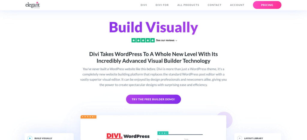
Divi
Divi is a popular WordPress theme and page builder created by Elegant Themes. It is known for its user-friendly interface and powerful design capabilities. Divi offers a drag-and-drop builder that allows users to visually design and customise their websites without any coding knowledge.
With Divi, you can choose from a wide range of pre-designed templates or start from scratch to create your own unique website. The theme includes a multitude of design elements, modules, and layouts that can be easily customised and rearranged to create any website design.
One of the standout features of Divi is its real-time visual editing, which means you can see your changes instantly as you make them. This helps streamline the design process and allows for quicker and more efficient website building.
Divi also offers advanced features such as custom CSS control, responsive editing, and global elements that allow you to maintain consistency throughout your website. It integrates seamlessly with popular WordPress plugins, making it a flexible and versatile choice for various types of websites.
Whether you’re a beginner or an experienced web designer, Divi provides a powerful platform for creating visually stunning and functional websites with ease.
One downside to the Divi page builder is that it causes your website to load a tad slower when compared to other builders, such as Oxygen or Bricks.
Pros
Cons
✅ User-friendly drag-and-drop interface. ✅ Real-time visual editing for instant feedback. ✅ Wide range of design elements and templates. ✅ Custom CSS control for advanced customisation. ✅ Responsive editing options for optimising across devices.
❌ Steep learning curve, especially for beginners. ❌ Potential performance impact if not optimized. ❌ Strong reliance on the Divi theme. ❌ Limited customisation without coding knowledge. ❌ Some limitations in integrating with third-party plugins.
Ideal for… Divi is a good option for businesses across various sectors due to its easy-to-use interface. It lets you simply drag, drop, and fully customise your website design. Plus, if you’re watching your budget, Divi is a real winner as it provides a lifetime license. However, keep in mind that if speed and performance are high on your priority list, this builder might not be your top choice.
Elementor has quickly risen to become one of the top WordPress page builders, revolutionising the website creation process.
Similar to Divi, Elementor makes it effortless for users of all skill levels to design and customise stunning websites. No coding knowledge is required, thanks to its extensive library of pre-built elements and widgets that can be simply dragged onto the canvas and customised to fit your vision. Elementor provides a seamless and interactive design experience, allowing you to see the changes in real-time as you create your website.
From adjusting layouts to fine-tuning colours, typography, and more, Elementor empowers you to have complete control over the visual appearance of your website, resulting in truly unique and captivating online experiences.
Pros
Cons
✅ User-friendly interface with a drag-and-drop editor. ✅ Extensive template library to kickstart your website design process. ✅ Advanced customization options to fine-tune every element of your website’s design. ✅ Responsive design capabilities to customize the layout for different screen sizes. ✅ Third-party integrations: Elementor seamlessly integrates with various plugins and extensions, expanding the functionality of your website. ✅ Free version available.
❌ Small learning curve for mastering all of its features and capabilities. ❌ Potential performance impact due to heavy design elements that may affect page load times.
Ideal for… Elementor is an excellent choice for businesses of all kinds that want to enjoy the flexibility and scalability of WordPress, without the necessity of knowing how to code. It’s the perfect pick for those who appreciate having extensive control and customisation options for their website’s layout. But, similar to Divi, remember that if your focus is on speedy performance, this builder may not be the optimal option for you.
Oxygen is a highly powerful and flexible WordPress builder specifically designed for advanced users who crave complete control over their website’s design.
With Oxygen, you have the power to customise every element of your site to perfection, from the overall layout and typography to the finest design details. Oxygen offers unparalleled level of flexibility, allowing you to create truly unique and highly customised website designs.
One of the major time-saving advantages of Oxygen is its ability to connect and template every element of your website. This feature is an absolute game-changer. Let’s say you want to make changes to a particular section or element that appears across multiple pages. In other builders, this would typically require manually editing each instance, which can be time-consuming. However, with Oxygen, you can create templates and connections, allowing you to make updates in one place and have them automatically applied throughout your website.
This saves you an immense amount of time, ensures consistency, and eliminates the risk of overlooking any elements. Oxygen’s ability to connect and template everything is a MASSIVE time-saver, enabling you to work efficiently and focus on other important aspects of your website design and development.
With Oxygen, you have the freedom to customise every element of your site, from layout and typography to intricate design details. However, due to its extensive capabilities and advanced features, mastering Oxygen may require some time and dedication.
Pros
Cons
✅ Full design control allows you to edit every aspect of your website’s design. ✅ The clean and lightweight tool results in faster loading times and improved website performance. ✅ Theme and plugin compatibility ensures seamless integration with the majority of WordPress themes and plugins. ✅ Code-savvy customisation provides advanced users with the ability to inject custom CSS and JavaScript code, enabling more extensive customisation and integration of third-party libraries or scripts.
❌ Steeper learning curve for beginners compared to other builders. ❌ Limited availability of pre-designed templates.
Ideal for… Oxygen is the perfect choice for individuals or web design agencies who possess a solid understanding of WordPress, HTML, and CSS, and are comfortable writing basic lines of code. It caters to developers and experienced users who want to take their website design and development skills to the next level.
Bricks, a relatively new addition to the WordPress builder landscape, brings a fresh and exciting approach to website creation. This builder stands out for its exceptional speed, providing users with a fast and efficient building experience. With Bricks, you can expect a smooth and seamless visual drag-and-drop interface that simplifies the website design process.
Bricks’ extensive collection of elements and templates is one of its strengths. It offers a wide array of pre-designed elements that can be easily customised and arranged to suit your needs. Whether you’re building a simple landing page or a complex multi-page website, Bricks have all the necessary tools to create stunning and professional-looking designs.
Furthermore, Bricks strongly emphasises user experience, ensuring that the building process is intuitive and enjoyable. The interface is designed to be user-friendly, allowing both beginners and experienced users to easily navigate and utilise its features.
Overall, Bricks is an exciting WordPress builder that offers super-fast performance, a visual drag-and-drop builder, and an extensive collection of elements and templates.
While it may have some learning curve and compatibility considerations, Bricks presents a promising option for users looking for a user-friendly and innovative website building experience.
Pros
Cons
✅ Super-fast performance ensures a smooth and efficient website building experience. ✅ Visual drag-and-drop builder eliminates the need for coding. ✅ Extensive collection of elements and templates kickstart your website design. ✅ User-friendly interface for both beginners and experienced users. ✅ Innovative approach offers users a unique and exciting website building experience. ✅ Lifetime pricing option allows you to enjoy ongoing access to the builder without recurring subscription fees.
❌ Limited market presence may result in a smaller community and fewer available resources. ❌ There is a learning curve for beginners who are new to website building. ❌ Customisation limitations exist for advanced users compared to more developer-oriented builders.
Ideal for… Bricks is ideal for individuals and businesses seeking a fast, flexible, and user-friendly website builder. It caters to both beginners and experienced users, providing a wide range of elements and templates. Whether you’re a freelancer, small business owner, or agency, Bricks is an amazing tool that focuses on speed and a user-friendly interface, making it perfect for efficient and enjoyable WordPress website development.
Let’s dive into the nitty-gritty—yes, we’re talking about pricing. Sure, it’s not the most exciting part of choosing your website builder, but the cost of your platform can greatly impact your profits, especially if you’re a budding small business or a rising freelancer.
We’ve created a pricing comparison table to help you navigate the financial waters. It lays out the starting, mid-tier, and top-tier price points for all the website builders we’ve discussed. But remember, these prices aren’t set in stone—they can change, and many builders have a wider range of plans or packages. So, make sure you hit those linked pricing pages for the freshest, most accurate details.
One last thing before we jump in: don’t get too caught up in the pricing. It’s essential to think about what you’re getting in return for your hard-earned cash. Reflect on your unique needs, your website’s goals, and the features that are non-negotiable for you. Sometimes, shelling out a little more for superior functionality, more storage space, or top-notch support can yield significant returns in the long run.
Choosing Between a Page Builder and a Web Builder: What’s Right for You?
The choice between a page builder and a web builder ultimately depends on your specific needs and preferences. Here are a few considerations to help you decide:
Scalability
Are you looking to grow your business/website in the future?
Do you think you will need additional advanced features?
If the answer to these questions is yes and you are looking to grow your business or website in the future and anticipate the need for additional features and functionalities, using a page builder within a WordPress framework is the recommended choice.
On the other hand, if you do not have plans for significant growth or if your website only requires basic features, you can get away with using a web builder like Wix or Squarespace.
Speed and Performance
Are speed and performance at the top of your priority list?
Are you planning to engage in SEO work or already working on it, with speed being a crucial factor for you?
If you answer yes, you can directly turn to builders like Bricks or Oxygen. These builders are renowned for their exceptional speed and performance, ensuring that your website operates smoothly and efficiently.
Design features
Are you looking to fully customise the design of your website?
Do you want overflow elements and eye-catching effects?
If your answer to these questions is yes, and you want complete control over the appearance of your website, using a page builder within the WordPress framework is the optimal choice. For beginners, page builders like Elementor or Divi provide a wide range of design options. If you have more experience with websites, builders like Bricks and Oxygen offer advanced features and customisation capabilities.
On the other hand, if you are happy with using pre-designed templates and don’t require extensive customisation options, a web builder like Wix or Squarespace can provide a simpler solution.
Easy of use
Are you new to website management?
Do you want to be able to handle your website on your own?
Are you looking for a hassle-free and fast solution?
If you answered yes to these questions and you want to have full control over your website without spending hours learning, while being comfortable using a template or predesigned template, then the best options for you are Wix or Squarespace.
However, if you have some coding knowledge and are seeking a more robust platform, and you’re willing to invest some time in learning for a better outcome, our recommendation is Webflow.
Conclusion
So, to sum it all up, picking the right website builder is super important if you want to establish a successful online presence and future-proof your business growth. In this blog post, we’ve talked about some of the best website and page builders of 2023. Each builder has its own strengths and weaknesses, catering to different user needs and skill levels.
If you’re new to website building or just want an easy-to-use experience without the need for extensive website growth, you can’t go wrong with Wix or Squarespace. They have user-friendly drag-and-drop interfaces and a wide range of templates to choose from. If you’re a bit more experienced and want more design flexibility, Webflow is the best option. And if you’re planning to open an online store, Shopify is the way to go.
If your business aims to grow, prioritize SEO, and require greater control and design flexibility, WordPress-based builders such as Elementor, Oxygen, Divi, and Bricks offer powerful features and are your best choice. If you prioritize SEO or want to ensure a smooth user experience, Oxygen or Bricks are the go-to options, thanks to their exceptional speed and performance.
We hope this comparison has helped you make a well-informed decision. Remember to explore further, try out free trials, and consider the features that matter most to you. Happy website building!
What is WordPress? A Comprehensive Guide for Beginners
So, you’ve been hearing a lot about WordPress but aren’t quite sure what it’s all about? No worries. We’ve got your back!
WordPress – a term that is essentially the backbone of the digital world, and yet, it might seem overwhelming to many.
If you are someone who has always wondered what WordPress is, how it functions, or how it can benefit you or your business, this blog post is designed specifically for you.
Let’s navigate through the world of WordPress!
What is WordPress?
WordPress is a free, open-source content management system (CMS) that gives users the freedom to create and manage their own websites and blogs.
Hold Up, What’s a CMS?
Before we dive any deeper, let’s take a minute to unpack what a CMS is. CMS stands for Content Management System. It might sound like tech jargon, but it’s just a tool that simplifies building and managing a website.
Think of a CMS as your personal digital toolbox for building websites. It’s kind of like using Lego for websites. You can add blocks (like blog posts, photos, or “about us” pages), move them around, or change their colours, and you don’t need to be a coding whizz to do it.
A CMS, like WordPress, takes care of all the complicated coding stuff in the background, so you can focus on the fun stuff, like creating awesome content and making your website look exactly how you want it to. It’s ideal for beginners but also powerful enough for web experts to create pretty much anything they want on the web.
Basically, WordPress is like the skeleton of a building, but for your website. You can build on, customise, and decorate the core structure to create your perfect online space.
WordPress has been around since 2003 and it now powers over 40% of all the websites on the Internet, which is quite impressive.
One of the primary reasons for WordPress’s immense popularity is its versatility. Whether you want to start a personal blog, build a business website, or set up an online store, WordPress can be your all-in-one solution.
WordPress.com vs WordPress.org: Understanding the Difference
When we talk about WordPress, it’s important to clarify that there are two different platforms: WordPress.com and WordPress.org.
WordPress.com
WordPress.com is a hosting service created by the co-founder of WordPress, Matt Mullenweg. This platform is user-friendly and requires minimal setup. It takes care of all the hosting aspects, allowing you to focus on the site’s content. However, you have limited control over the customisation and monetisation aspects.
WordPress.org
WordPress.org, often referred to as self-hosted WordPress, gives you complete control over your website. You can add free, paid, and custom WordPress plugins and themes and have complete control over the data and monetisation. The only trade-off is that you must manage your web hosting, which can be a bit complex for beginners.
Conclusion
WordPress is a powerful, flexible, and accessible platform for anyone looking to venture into the digital world. Whether you’re a hobby blogger, an aspiring entrepreneur, or an established business, WordPress provides an efficient way to create and manage your online presence.
Web Design for Accessibility: Meeting WCAG Guidelines
As you’re probably well aware, one of the most critical aspects of web design is ensuring that our content is accessible to everyone. Yes, that’s right – EVERYONE. And when I say everyone, I mean people of all abilities.
So, I thought it would be helpful to talk a little about the WCAG guidelines (that’s the Web Content Accessibility Guidelines, for any newcomers out there) and how we can use them to make the internet a better place for all in 2023. So buckle up and let’s dive in!
What are The WCAG Guidelines?
First things first, let’s make sure we’re all on the same page with what the WCAG guidelines actually are. They’re a set of recommendations designed to make web content more accessible, particularly for people with disabilities. Think of it like a handbook for inclusivity on the web.
Since their first version in 1998, the guidelines have gone through a series of updates to accommodate the ever-changing digital landscape. As of my last update, we’re working with WCAG 2.2, which was released in 2021.
The Core Principles of WCAG
The WCAG guidelines revolve around four core principles, often referred to by the acronym POUR: Perceivable, Operable, Understandable, and Robust. Here’s a brief rundown:
Perceivable: Information and user interface components must be presentable to users in ways they can perceive. This means that users must be able to perceive the information being presented (it can’t be invisible to all of their senses).
Operable: User interface components and navigation must be operable. This means that users must be able to operate the interface (the interface can’t require interaction that a user cannot perform).
Understandable: Information and the operation of user interface must be understandable. This means that users must be able to understand the information as well as the operation of the user interface (the content or operation can’t be beyond their understanding).
Robust: Content must be robust enough that it can be interpreted reliably by a wide variety of user agents, including assistive technologies. This means that users must be able to access the content as technologies advance (as technologies and user agents evolve, the content should remain accessible).
Your Handy Accessibility Checklist
Now, let’s get to the part you’ve been waiting for: the checklist! Here are a few actionable steps to ensure your website is accessible, following WCAG guidelines.
Use Semantics Correctly: Make sure you’re using the correct HTML elements for their intended purpose. This helps assistive technologies interpret your content correctly.
Provide Text Alternatives for Non-Text Content: This includes using alt text for images and transcripts for videos.
Make Sure Your Site Is Keyboard-Friendly: This should be a no-brainer, but you’d be surprised how many sites miss this! All functionality should be accessible using a keyboard.
Avoid Time Limits: Don’t limit how long users have to read content or input information.
Make Sure Text is Readable and Understandable: Use a readable font size and ensure sufficient contrast between text and its background. Also, avoid complex language where possible.
Create Content That’s Predictable: The order in which users navigate your site should make sense. Avoid changing the context of a page unexpectedly.
Help Users Avoid and Correct Mistakes: If users make an error, clearly explain what the error is and how to correct it.
Maximise Compatibility: Your site should be compatible with current and future tools, including assistive technologies and different browsers.
So, there you have it! That’s your crash course in WCAG and web design for accessibility in 2023. It’s up to us as web designers to make the internet a place that’s truly inclusive for everyone. So let’s get out there and make some wonderfully accessible web content! Remember, our designs can open up the world for someone.
Website Design Guidelines
How to Achieve the Perfect Balance between Aesthetics and Functionality in Web Design
In today’s digital world, having a visually appealing website is no longer enough to attract and retain visitors. Users expect beautiful and functional websites allowing them to navigate and find the necessary information easily. Achieving this perfect balance between aesthetics and functionality can be challenging for web designers, but it’s essential for creating a successful online presence. In this blog post, we’ll explore tips and tricks to help you achieve the ideal blend of form and function in your web design projects.
Introducing Web Design Fundamentals
Web design is the process of creating a website that is both aesthetically pleasing and functional. The goal is to create a visually appealing site that is easy to use and navigate. There are many factors to consider when designing a website, such as a layout, colour scheme, font choice, and content. It can be overwhelming to balance these elements, but it is important to create a successful website.
The first step in web design is to determine the site’s purpose. What are you trying to accomplish with your website? Once you know the site’s purpose, you can begin to plan the layout and design. The layout should be simple and easy to understand, with clear navigation. The colour scheme should be cohesive and complement the site’s overall design. And finally, the content should be well-written and relevant to the website’s topic.
If you take the time to consider each of these elements carefully, you can create an aesthetically pleasing and functional website. By following these tips, you can perfectly balance aesthetics and functionality in web design.
Common Elements of a successful website design
Many elements go into making a successful website design, but there are some common features that all successful websites share. Here are some of the most important elements of a successful website design:
Layout: The layout of a website is important for both aesthetic and functional purposes. A well-designed layout will ensure that your content is easy to read and navigate and looks good.
Design: The design of your website should be both eye-catching and user-friendly. Avoid cluttered designs with too much text or images, as this can overwhelm visitors. Instead, focus on creating a clean and stylish design that makes it easy for users to find what they want.
Content: Content is king when it comes to website design. Ensure your content is high-quality and engaging, as this will keep visitors coming back.
Search Engine Optimisation (SEO): SEO refers to optimising your website for search engines to appear higher in search engine results pages (SERPs). This means ensuring your website has relevant keywords, well-written content, and a mobile-friendly design.
Navigation: Navigation is an important part of any website design. Ensure your navigation is intuitive and easy to use, so visitors can easily find what they’re looking for.
Speed: The speed at which a website load is important for user experience. If your website takes too long to load, visitors may become frustrated and leave before seeing what you offer.
Security: Security is essential for any website, as it helps ensure user data’s safety. Ensure your website has security protocols to protect users’ information.
Choosing the Right Colour Scheme for Your Website
There are a few things to consider when choosing the right colour scheme for your website. The first is the overall look and feel you want to achieve. For example, are you going for a minimalist design or something more ornate? The colours you choose should complement the overall tone of your site.
The second thing to consider is functionality. Certain colours are easier to read on screen than others. For example, dark text on a light background is generally more legible than light text on a dark background. If you want people to stay on your site and read your content, choose colours that will be easy on the eyes.
The third thing to think about is your brand identity. If you already have an established brand, you’ll want to use colours that are consistent with what people already associate with your business. This will help create a cohesive look and feel across your marketing materials, from your website to your social media accounts.
Choosing the right colour scheme for your website doesn’t have to be difficult. By considering the overall aesthetic you’re going for, the functionality of the site, and your brand identity, you can narrow down your choices and find a palette that works for you.
What Fonts Will Best Represent Your Brand?
The first step is understanding what fonts are available and how they best represent your brand. There are two types of fonts: serif and sans serif. Serif fonts have small lines at the end of each letter, while sans-serif fonts do not. Each type of font serves a different purpose and can create a different feeling for your brand.
Serif fonts are typically seen as more traditional, serious, and formal and are often used for business or academic purposes. Some examples of serif fonts are Times New Roman, Georgia, and Cambria.
On the other hand, Sans serif fonts are seen as more modern, simple, and clean and work well for brands that want to appear approachable and friendly. Some examples of sans serif fonts are Arial, Helvetica, and Verdana.
Once you understand the different types of fonts available, you can start narrowing down which ones will work best for your brand. Consider the overall feeling you want to convey with your website design. For example, a serif font may be a good choice if you want something classic and timeless. Sans-serif fonts may be better if you prefer a more modern look.
In addition to your website’s overall feeling, consider the specific message you want to communicate with your font choice. For example, if you’re designing a website for a law firm, a serif font may be more appropriate since it conveys a sense of professionalism and trustworthiness.
Finally, make sure you’re considering how legible your font choice is. The font should be easy to read and not distract from the main message of your website.
Ultimately, choosing fonts for your brand depends on what kind of feeling you want to create and what message you want to communicate with your design. Take some time to research different fonts and experiment until you find the perfect one that fits your needs.
Incorporating Visual Hierarchy in Design
In web design, achieving the perfect balance between aesthetics and functionality can be challenging. However, incorporating visual hierarchy into your design can help create a more balanced and effective overall design.
Visual hierarchy uses various design elements (e.g. colour, size, shape, etc.) to create a hierarchy of importance. When used correctly, visual hierarchy can help guide users through a design that is aesthetically pleasing and functional.
There are a few key things to keep in mind when incorporating visual hierarchy into your web design:
Use contrast to create visual interest and draw attention to important elements.
Use a scale to emphasise certain elements over others.
Use alignment to organise information in a way that is easy to understand and visually appealing.
Use grouping to separate different types of information and make complex designs more manageable.
By following these guidelines, you can create a web design that is both beautiful and functional. Remember to experiment with different techniques until you find the best combination for your project.
How to Make Sure Your Website Is Responsive and Mobile-Friendly?
Your website is the face of your business, so it’s important to ensure it’s responsive and mobile-friendly. Nowadays, more and more people are using their mobile devices to access the internet, so your website must be optimised for these users. Here are a few tips on how to make sure your website is responsive and mobile-friendly:
Use responsive design. This means your website will automatically adjust to fit any screen size, whether a desktop, laptop, tablet, or smartphone.
Use large font sizes. Ensure your font sizes are large enough to be easily readable on a small screen.
Use icons instead of text. Icons are easier to see and understand on a small screen than text, so use them whenever possible.
Simplify your design. Keep your design clean and simple so that it’s easy to navigate on a small screen.
Test your website on different devices. Test your website on all devices to ensure it looks and works well on all of them.
Optimising Your Website Content for SEO
Your website’s content is one of the most important elements in SEO. There are a few things you can do to make sure your content is optimised for search engines:
1. Use keyword-rich titles and descriptions. This will help your content show up in search results for those keywords.
2. Structure your content using headings and subheadings, making it easier for search engines to understand and index your content.
3. Include relevant keywords throughout your content. This helps search engines understand your content and match it with relevant searches.
4. Keeping your content fresh by regularly adding new and updated information helps keep your site indexed by search engines and keeps visitors coming back for more.
5. Make sure your website is accessible to both search engines and users by using proper coding and structure. This will ensure that both groups can find and use your content easily.
Utilising Advanced Technologies in Web Design
As a web designer, it is important to find the perfect balance between aesthetics and functionality when creating a website. One way to achieve this balance is by utilising advanced technologies in your web design.
Various advanced technologies can improve a website’s aesthetic and functional aspects. For example, CSS3 and HTML5 are newer programming languages allowing more complex styling and animation effects. Additionally, a responsive design can ensure that your website looks great and functions properly on all devices.
When utilising advanced technologies in your web design, keeping the user experience in mind is important. Make sure that any features you add are easy to use and understand. Otherwise, you can avoid confusing or frustrating your visitors.
By finding the perfect balance between aesthetics and functionality, you can create a website that is both beautiful and easy to use. Utilising advanced technologies can help you achieve this balance and build a better website overall.
Conclusion
Achieving the perfect balance between aesthetics and functionality in web design is challenging yet achievable. By following our tips and keeping your user’s needs in mind, you can create an aesthetically pleasing and functional website that will engage your users, keep them coming back for more and help to achieve your business goals. With careful planning, thoughtful design decisions and a little creativity, you, too, can have the perfect balance between aesthetic appeal and practicality for your business’s website!
UX vs UI Design: Understanding the Differences
UX (User Experience) and UI (User Interface) design are two critical components of the digital product development process. While both disciplines focus on creating a seamless user experience, they have distinct goals and responsibilities. In this article, we will explore the difference between UX and UI design and why it’s important to understand it.
What is UX Design?
UX design is the process of enhancing user satisfaction by improving the overall experience of a product. UX designers research, test, and iterate on various design elements to create a product that is easy to use, accessible, and effective in meeting the user’s needs. The primary focus of UX design is to make sure the user’s experience with the product is positive, by considering factors such as usability, ease of navigation, and overall satisfaction.
The Goal of UX Design
The goal of UX design is to create a product that meets the user’s needs and provides a positive experience. This includes making the product easy to use, accessible, and effective in meeting the user’s needs.
What is UI Design?
UI design is concerned with the visual design of a product’s interface. UI designers are responsible for creating a visually appealing and intuitive interface that supports the overall user experience. They focus on the look and feel of the product, including typography, color scheme, and the placement of elements such as buttons and icons.
The Goal of UI Design
The goal of UI design is to make the product’s interface aesthetically pleasing and easy to use, while also providing a seamless and consistent user experience.
UX and UI Design: Two Sides of the Same Coin
UX and UI design are not mutually exclusive and often overlap in various aspects. A great UX design is crucial for a successful product, but it is also important to have a visually appealing and intuitive UI design to ensure the user experience is seamless and enjoyable.
The Importance of Understanding the Difference Between UX and UI Design
Understanding the difference between UX and UI design is crucial for anyone involved in the design and development of digital products. It helps to ensure that the product meets the user’s needs and expectations and provides a positive experience. By understanding the difference between UX and UI design, designers, developers, and product managers can work together to create a successful product that meets the user’s needs.
How do UX design and UI design work together?
UX design and UI design are two essential components of effective web and app design. While UX design focuses on the overall experience of using a product, UI design focuses on the specific interface elements that users interact with. Together, these disciplines help to create products that are both easy to use and visually appealing. When designing a website or app, the UX designer will first create wireframes or prototypes that outline the overall structure and flow of the user experience. Once the client has approved these, the UI designer can begin creating the visual elements that will make up the interface. This includes things like buttons, icons, and fonts. UX and UI designers must work closely throughout the design process to ensure that the final product is consistent and cohesive. By considering both usability and aesthetics, they can create products that are functional and enjoyable to use.
For example, a UX designer might create a low-fidelity prototype of a new feature which a UI designer would then take and turn into a high-fidelity mockup. Ultimately, both UX and UI designers are working towards the same goal: creating digital products that are enjoyable and easy to use for all users.
SSL Certificates Simplified: What You Need to Know About Securing Your Website
As the internet becomes an increasingly important part of everyday life, it’s essential to ensure that your website is secure. One way to do this is by getting an SSL certificate. But what exactly is an SSL certificate, and why should you get one? This article will explain SSL certificates and why they’re so important. Read on to find out more!
What is an SSL Certificate?
An SSL Certificate is a digital certificate that establishes the identity of a website and encrypts information sent to the server using SSL technology. SSL Certificates are typically used to protect credit card transactions, data transfer and login credentials.
The certificate contains information about the website’s owner, including the domain name, company name, address and other information. It also contains a public key to be used for encryption and a private key for decryption. The SSL Certificate is then digitally signed by a Certificate Authority (CA) to verify its authenticity and integrity.
The Benefits of Using SSL Certificates
If you’re running a website, you need an SSL certificate. Period. You need an SSL certificate even if you don’t take payments on your site and don’t handle sensitive information. Here’s why:
An SSL certificate is the best way to protect your website from attacks. It encrypts all the information that passes between your website and visitors’ browsers, making it impossible for hackers to eavesdrop on the communications.
An SSL certificate also authenticates your website. This means that your visitors can be confident that they’re communicating with your site and not a fake site set up by a hacker.
Finally, an SSL certificate helps to improve your search engine ranking. For example, Google has stated that they prefer sites that use SSL certificates in their search results.
So there are three good reasons to get an SSL certificate for your website; if you’re not already using one, go get one now!
Different Types of SSL Certificates
There are three main types of SSL certificates: Domain Validated (DV), Organization Validated (OV), and Extended Validation (EV).
Domain Validated (DV) Certificates are the most basic type of certificate. They provide encryption for data transmitted over HTTPS but do not confirm who owns or operates the domain or any other details about it. This makes them suitable for websites with no sensitive information, such as blogs or simple informational sites. Domain Validated certificates are the most basic and are typically the easiest and fastest to obtain. All you need to do is prove that you own the domain.
Organization Validated (OV) Certificates are more secure than DV certificates because they require proof that a company owns or operates the domain name in question. The issuing authority verifies domain ownership before granting OV certs which provide extra trustworthiness to customers visiting the site. These are suitable for sites with sensitive information, such as online stores and banking sites.
Extended Validation (EV) Certificates provide an even higher level of security than OV certificates because they require proof that a company owns or operates the domain name in question and also confirms its identity through detailed verification procedures before granting EV certs which provide maximum trustworthiness to customers visiting the site. These are suitable for e-commerce sites that handle sensitive customer data such as credit cards or social security numbers. Extended Validation certificates offer the highest level of security and trust, as they require a rigorous vetting process.
So, which type of SSL certificate is right for you? It depends on your needs. For example, a DV certificate will likely suffice if you’re just looking to secure a personal website. But if you’re running an online business or handling sensitive information, you’ll want to go with an OV or EV certificate.
How to Choose the Right SSL Certificate
When it comes to SSL certificates, there are a lot of different options to choose from. So how do you know which one is right for your website? Here are a few things to keep in mind when choosing an SSL certificate:
What type of website do you have? If you have a simple website with only a few pages, you probably don’t need an Extended Validation (EV) SSL certificate. EV certificates are more expensive and are usually only necessary for eCommerce websites or other sites that handle sensitive information.
How much traffic does your website get? If you have a high-traffic website, you’ll want to choose an SSL certificate that can handle the volume. Otherwise, your site may experience a slowdown or even crash.
What’s your budget? Obviously, the cost is going to be a factor in your decision. But don’t sacrifice security to save a few bucks – it’s not worth it!
Keep these things in mind, and you should be able to find the right SSL certificate for your website.
Installing and Configuring an SSL Certificate
Installing and configuring an SSL certificate is a relatively simple process, but there are a few things to keep in mind. First, you’ll need to generate a CSR (Certificate Signing Request) from your server. This can be done through your hosting control panel or via the OpenSSL command line tool. Once you have your CSR, you’ll need to purchase an SSL certificate from a trusted Certificate Authority. Once you have your certificate, you can install it on your server. Again, this can be done through your hosting control panel or the OpenSSL command line tool. Finally, you’ll need to configure your web server to use the new SSL certificate. This will vary depending on which web server software you use, but most servers make it fairly straightforward to configure SSL.
Troubleshooting Common Issues with SSL Certificates
If you’re having trouble with your SSL certificate, there are a few common issues that you can check. First, make sure that your certificate is valid and has not expired. If it has expired, you’ll need to renew it. You can check the validity of your certificate by visiting the Certificate Authority’s website and looking up your certificate’s serial number.
If your certificate is valid but still has problems, try restarting your web server. Sometimes the server just needs a fresh start to recognize the new certificate. If that doesn’t work, check your web server’s configuration to ensure the correct certificate is used. Finally, if you’re still having trouble, contact the support team for your web server or the Certificate Authority for help troubleshooting the issue.
Alternatives to SSL Certificates
If you’re running a website, you need an SSL certificate. Period. No ifs, and, or buts about it. SSL certificates provide encryption and authentication for your website, ensuring that your visitors’ data is safe from third-party interception.
But what if you can’t afford an SSL certificate? Or what if your website doesn’t warrant the added security of an SSL certificate? In these cases, there are alternatives to SSL certificates that can provide some level of protection for your website.
One alternative is to use a VPN. A VPN encrypts all of the traffic between your computer and the VPN server, making it impossible for third parties to intercept or eavesdrop on your traffic. However, VPNs can be slow and expensive, so they’re not ideal for all websites.
Another alternative is to use HTTP Strict Transport Security (HSTS). HSTS is a header that tells browsers to always connect to a website using HTTPS, even if the user types in http://www.example.com. This prevents man-in-the-middle attacks and ensures that all traffic to and from your website is encrypted. However, HSTS requires that you have an SSL certificate installed on your server before enabling it.
Finally, you can use a content delivery network (CDN) that provides SSL protection for your website. CDNs are networks of servers that deliver content to users based on their geographic location.
How can I get an SSL certificate for my website?
If you’re looking to add an SSL certificate to your website, there are a few things you’ll need to do. First, you’ll need to generate a CSR (Certificate Signing Request) from your server. Once you have your CSR, you’ll need to submit it to a CA (Certification Authority) for approval. After your certificate is approved, you’ll need to install it on your server and configure your site to use HTTPS.
How can I tell if my website has SSL?
If you’re unsure whether your website has SSL, there are a few ways to check. First, look for HTTPS:// at the beginning of your website’s URL. If you see it, that means your website is using an SSL.
Another way to tell is to look for a padlock icon in your browser’s address bar. When you’re on an SSL-secured website, this icon will be visible.
Finally, you can check with your web hosting provider to see if they offer SSL certificates. If they do, that means you can add SSL to your website.
Importance of SSL Certificates for SEO
An SSL certificate is important in SEO because it helps ensure a website’s security. A secure website is more likely to be ranked higher in search engine results pages, which can lead to increased traffic and conversions. When a website is secure, it also instils trust in visitors, which can further improve conversions.
Overall, the importance of SSL for SEO cannot be understated. If you are not already using SSL on your website, then consider doing so. It could significantly affect your website’s security and search engine ranking.
Conclusion
In summary, SSL certificates are a must-have for any business. They protect your website from malicious attacks and help you to be seen as trustworthy by customers. Installing an SSL certificate is simple, and there are plenty of options today. Take the time to research the different types of certificates available and find one that meets your specific needs. An SSL certificate will help secure your website and give visitors peace of mind when browsing or making purchases online.
Responsive Web Design: Best Practices, Key Features & How to Get It Right
Having a website that looks great on all devices is essential for businesses today. With the ever-evolving landscape of technology, it’s important to keep up with the latest trends in web design. Enter Responsive Web Design: a technique that enables you to design websites that look and function optimally on any device. This article will cover what Responsive Web Design is, why it matters, and how to do it right.
Introduction to Responsive Web Design
Responsive web design is the approach that suggests that design and development should respond to the user’s behaviour and environment based on screen size, platform and orientation.
In other words, responsive web design creates a system in which a website can automatically adjust its layout, images and other elements to fit perfectly on any screen size – from a large desktop monitor to a small smartphone.
This is all made possible by using fluid grids, flexible images and media queries; we’ll cover all of these concepts in more detail later on. But for now, responsive web design allows us to create websites that look great and work well no matter what device they’re being viewed on.
What is Responsive Web Design?
Responsive web design is a term that refers to the development of websites that adapt to the different screen sizes and resolutions of devices such as smartphones, tablets, and desktop computers. In other words, responsive design ensures that a website looks and works great no matter what device it’s being viewed on.
Responsive web design has three main components: fluid grids, media queries, and flexible images and media.
Fluid grids are the foundation of responsive design. They are composed of a series of rows and columns that can be resized to fit any screen size. This allows content to flow smoothly and evenly across all devices.
Media queries are CSS rules that allow different stylesheets to be applied depending on the width of the device’s screen. This is what enables a website to change its layout when viewed on different devices.
Flexible images and media are also important for responsive design. Images need to be resized without losing quality, and videos should be able to play seamlessly on all devices.
Responsive web design is essential for creating great websites that work well on all devices. By using fluid grids, media queries, and flexible images and media, you can ensure that your website will always provide a great user experience no matter how it’s being accessed.
Why is Responsive Web Design Important?
Responsive web design is important because it allows website owners to provide an optimal viewing experience for their visitors, regardless of the device or screen size being used. This is especially important in today’s mobile-first world, where more people are accessing the internet from their smartphones and other devices than ever before.
With responsive design, website owners can ensure that their site will look great and be easy to use no matter what device someone is using. This is accomplished by using a responsive layout that automatically adjusts to fit the screen size, as well as using responsive images and other media.
Additionally, responsive design can help improve search engine optimization (SEO) and make it easier for people to share your content on social media. These factors can lead to more traffic and engagement on your website, which can ultimately translate into more customers or conversions.
What are the Benefits of Responsive Web Design?
There are many benefits of responsive web design.
Increased User Experience
Responsive web design has many benefits, but one of the most important is its improved user experience.
With a responsive website, users will have a better experience as they can view the site correctly on any device, whether it be a desktop computer, laptop, tablet or smartphone. The content will be easy to read, and navigation will be straightforward, meaning users are more likely to stay on the site and convert into customers.
In addition, responsive web design can improve your search engine ranking as Google now considers mobile-friendliness when determining where to rank websites in its search results. If you want your website to perform well in search, you must ensure it is responsive.
Increased SEO Rankings
As we all know, SEO is important for any website looking to rank high in search engine results. But what many need to realize is that responsive web design can significantly impact your website’s SEO rankings.
Here’s why: Google (and other search engines) now factor in a website’s mobile-friendliness when determining its rankings. So if your website is not optimized for mobile devices, you’re likely to see a drop in your SEO rankings.
But it’s not just Google that cares about responsive design. Your visitors do too. Studies have shown that people are more likely to trust and engage with websites that are optimized for their devices.
So if you’re looking to improve your SEO rankings and give your visitors a better experience, responsive web design is the way to go.
Increased Mobile Traffic
As the world increasingly shifts to mobile devices, it’s more important than ever for websites to be designed responsively. By providing a responsive design, your website can adapt its layout and content to suit better the device it’s being viewed on. This results in a better user experience, which can lead to increased traffic and conversions.
A responsive website is one that is designed to adjust its layout and content based on the device it’s being viewed on. This means that whether a visitor is viewing your site on a phone, tablet, or computer, they will always have the best experience possible.
One of the main benefits of having a responsive website is that it can help you increase your mobile traffic. Google has stated that they are now using mobile-friendliness as a ranking factor in their search results. However, if your website is not responsive, you could miss out on valuable traffic from mobile users.
Another benefit of Responsive Web Design is that it can help improve your conversion rate. For example, a study by HubSpot found that websites with a responsive design saw an uplift in conversion rates by over 20%. So not only can RWD help you increase traffic, but it can also help you boost sales and leads.
Essential Elements of a Responsive Website
As the name suggests, responsive web design is all about how a website responds to different screen sizes and devices. In other words, it’s a way to ensure your site looks good and functions well no matter where it’s being viewed.
Responsive design is essential because more people than ever are accessing the internet from mobile devices. In fact, according to StatCounter, over 51% of internet traffic worldwide came from mobile phones in 2019.
Moreover, Google has stated that its search algorithm favours mobile-friendly websites. So if you want your site to rank well in search results, you need to ensure it’s responsive.
A responsive website has three key elements: fluid grids, flexible images, and media queries.
Fluid grids allow your content to flow seamlessly across different screen sizes. Flexible images automatically adjust to fit different screen widths, and media queries allow you to create different stylesheets for different devices.
Together, these elements ensure that your website looks great and works well no matter where it’s being viewed.
Tips for Optimizing Your Website for Mobile Users
Make sure your website is responsive. This means that it will adjust to fit any screen size, whether it’s a desktop computer, laptop, tablet, or smartphone.
Use large font sizes and buttons. Mobile users have smaller screens and fingers, so it’s important to make your text and buttons large enough to be easy to read and click on.
Simplify your design. Stick to a single-column layout and use minimal graphics. This will make your website easier to navigate on a small screen.
Optimize your images. Resize them, so they load quickly on a mobile connection and compress them using Photoshop or Kraken.io.
Use Accelerated Mobile Pages (AMP). AMP is a Google-backed project that creates lightweight versions of web pages for mobile devices. It can significantly improve the loading speed of your website on mobile devices.
How To Test Your Site for Responsiveness
A responsive website can adapt to the device it is being viewed on. This means that whether a user is viewing your site on a desktop computer, a tablet, or a smartphone, they will be able to see the content in a way that makes sense for that particular device.
It’s important to test your site for responsiveness before launching it because you want to ensure that all users will have a positive experience no matter how they access it.
There are a few different ways you can test your site for responsiveness:
1. Use an online tool like Google’ Mobile Friendly Test (https://search.google.com/test/mobile-friendly). This tool will allow you to enter your website’s URL and view how it looks on different devices.
2. Use your own devices. If you have access to different types of devices (e.g., a desktop computer, a laptop, a tablet, and a smartphone), try loading your website on each one and see how it looks. Ensure all the content is easy to read and navigate on each device.
3. Ask someone else to test it out. If you know someone who has access to different devices, ask them to load up your site and give you their feedback. They may notice things that you didn’t even think about!
Testing your website for responsiveness is important in ensuring that all users will have a positive experience when they visit your site. Make sure to do it before you launch so you can be sure that everyone will be able to view your content without any problems.
Common Mistakes to Avoid
Regarding responsive web design, a few common mistakes can trip you up if you need to be more careful. Here are four of the most common mistakes to avoid when creating a responsive website:
1. Not planning for mobile from the start.
One of the biggest mistakes you can make with responsive design is not planning for mobile from the start. With mobile traffic now accounting for over 50% of all web traffic, ensuring your site is optimized for smaller screens is more important than ever. Start by ensuring your content is easily consumable on a smaller screen, then move on to optimizing your images and other media for responsive delivery.
2. Not using a responsive framework.
Another common mistake is starting from scratch when building a responsive website. While creating a responsive site without using a framework is possible, it’s generally much easier (and quicker) to use an existing framework like Bootstrap or Foundation. These frameworks provide pre-built CSS and JavaScript that can help save you time and speed up the development process.
3. Overlooking performance issues.
A common pitfall of responsive design forgets about performance issues. When designing for multiple devices, it’s important to keep in mind that not all users will have the same connection speed or bandwidth limitations. Instead, ensure your site loads quickly on all devices by compressing images, minifying code, and using a content delivery network (CDN).
4. Not testing across multiple devices.
The final mistake to avoid is not testing on multiple devices. With so many different screen sizes and resolutions available, it’s important to test your site across various devices to ensure it looks and works as expected. For example, don’t just rely on desktop browsers for testing; check on mobile phones, tablets, and other handheld devices.
Responsive Web Design assists SEO
As the world increasingly shifts to mobile devices, it’s more important than ever for websites to be designed with responsive web design (RWD). Not only does RWD provide an optimal viewing experience for users on all devices, but it also helps improve your search engine optimization (SEO).
Here’s a closer look at how RWD assists SEO:
RWD ensures that search engines can easily crawl and index your website. With traditional desktop-only websites, search engines have to crawl and index multiple versions of the same site – one for each type of device. This can lead to duplicate content issues and decreased crawling efficiency. But with a responsive website, only one version of the site needs to be crawled and indexed. This makes it easier for search engines to find and index your content, which can help improve your SEO ranking.
RWD can help improve your click-through rate (CTR) from SERPs. Studies have shown that mobile-friendly websites have a higher CTR than non-responsive sites. And since CTR is a major ranking factor for SEO, this can indirectly help improve your SEO ranking.
RWD can make your website faster and more lightweight. A faster website provides a better user experience and can also help improve your SEO ranking. Google has stated that page speed is a ranking factor for mobile searches, so if you want to improve your SEO on mobile devices, making your
As more and more people use mobile devices to access the internet, your website must be designed to respond to these different screen sizes. Responsive web design ensures that your website will look great and work well no matter what device someone uses. This is important for both users and search engines.
Users are more likely to stay on a website that works well on their device, and search engines take user experience into account when ranking websites. So by ensuring your website is responsive, you’re providing a better user experience and helping your SEO efforts.
Conclusion
Responsive web design is an important and growing trend in website development. It helps ensure that users have a good experience on any device they use to access your site, and it can save you time and money compared to developing separate sites for each different platform. By understanding the basics of responsive web design, including why it matters, what it entails, and how to do it correctly, you’ll be able to create a website that looks great across all devices.